Rebrand Introduction – BMS Herlev
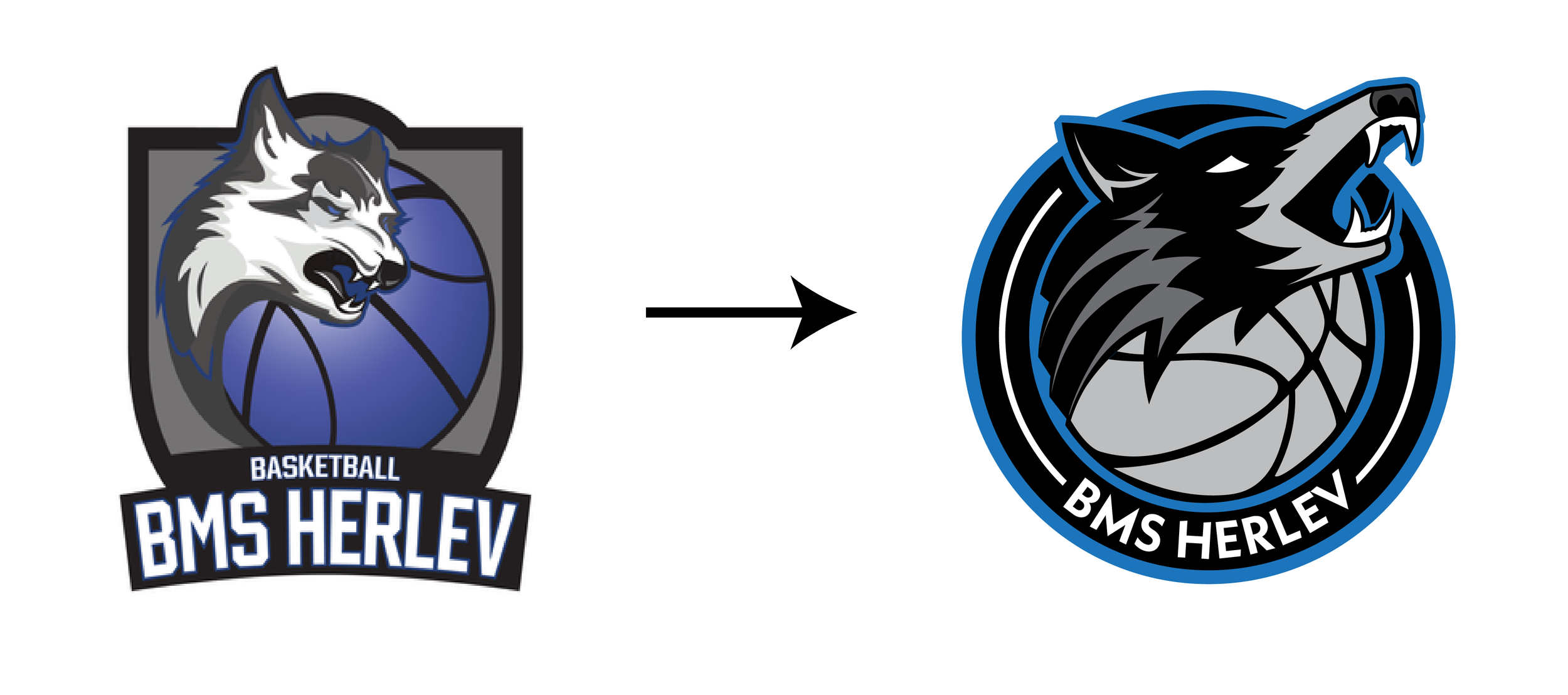
BMS Herlev has a strong legacy in Danish basketball, built on passion, competition, and community. As the team continues to evolve, so does its identity. This rebrand refines and modernizes the BMS Herlev brand while preserving the core elements that fans recognize and love.
My goal was to create a cleaner, bolder, and more balanced visual identity—one that reflects the team’s strength on the court and its growing presence in Danish basketball. By eliminating unnecessary details and refining the design, we’ve built a brand that is more impactful, versatile, and timeless.
Primary Logo – A Modernized Legacy
The new BMS Herlev logo retains the essence of the previous design, with the iconic wolf wrapping around a basketball, but reimagines it with a cleaner, more symmetrical composition. The circular structure creates a strong, unified mark, ideal for branding across all platforms.
Key refinements include:
Stronger contrast and boldness – Ensuring maximum visibility and impact.
Elimination of gradients – Creating a sleek, modern look that translates flawlessly across digital and print media.
Updated typography – A modern, sharp, and athletic font enhances the team’s professional presence.
This redesigned mark ensures that BMS Herlev stands out with a dynamic yet timeless identity that embodies the team’s power and determination.
Secondary Logo – A Sleek Wordmark
To complement the primary mark, the secondary logo provides a simplified, refined spellout of "BMS Herlev." It incorporates the fresh stripe design seen in the main logo, framing the team’s name within a structured, bold layout.
This secondary mark offers:
A clean, minimalist alternative for various applications.
A cohesive brand extension that ties back to the primary logo while standing strong on its own.
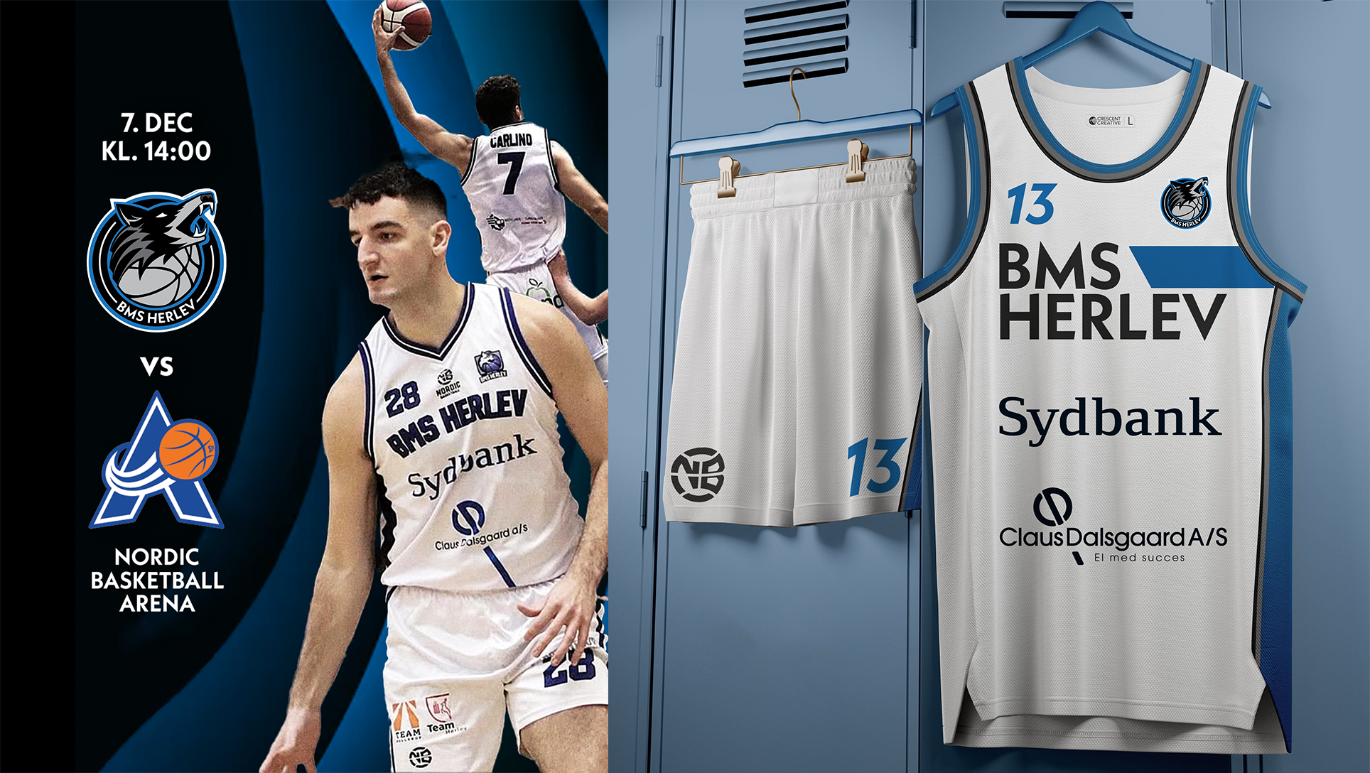
Versatility for merchandise, social media, and digital branding, ensuring a consistent identity across all platforms.


